
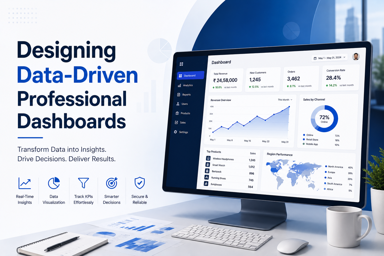
Data overload is a real problem. When you show a user too many metrics at once, they experience decision paralysis. The goal of a professional dashboard is not to display all the data you have, but to display the right data at the right time. A well-designed dashboard transforms raw numbers into a clear, actionable narrative.
The Principle of Progressive Disclosure
Great dashboards show only the critical KPIs at a glance, allowing users to drill down into the specifics only when they need to. By structuring information hierarchically, we keep the interface clean while preserving deep analytical capabilities.
"A successful dashboard design doesn't answer every question immediately. It answers the most important question instantly, and provides an intuitive path to answer all the rest."
Visualizing with Purpose
Choosing the right chart type is crucial. We avoid complex, hard-to-read visualizations in favor of clear, standardized graphs. We use color strategically to highlight anomalies and draw attention to metrics that require immediate action, rather than just decorating the screen. This is especially vital for custom logistics tracking dashboard development India, where real-time clarity prevents massive supply chain bottlenecks.
Furthermore, modern dashboards must be responsive. Executives need to monitor real-time data from their phones just as easily as analysts querying data on large desktop monitors. We ensure our layouts adapt fluidly to any screen size.
Turn your data into decisions.
Discover our Professional-Dashboard Development Services.
Share this article
If you found this helpful, pass it along to your network.